Tag Archive for: Data & Research

Transform Communities Using Geospatial Solutions

As seen on GovLoop.

Since 1992, the Institute for Public Strategies (IPS) advances the health and safety of communities throughout the country and Mexico. The agency looks at policies and systems that play a role in alcohol and other drug (AOD) abuse, and factors that lead to crime and blight in neighborhoods. They work with communities to bring fresh produce and awareness of nutrition to underserved neighborhoods. They help facilitate self-sufficient, fully engaged community members into becoming champions for their neighborhoods by giving them tools to work with policymakers effectively and strategically.

To do this, IPS created the A.C.T. Model – Approach to Community Transformation. This multiprong approach guides the agency’s efforts in working with policymakers, enforcement agencies, civic leaders, businesses, faith communities and residents to help realize the type of communities we want to live in.

Act Model
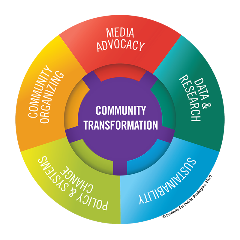
Geographic information systems (GIS) plays a large part in the success of its efforts. IPS uses this technology in all five components of the A.C.T. Model.

Data and Research

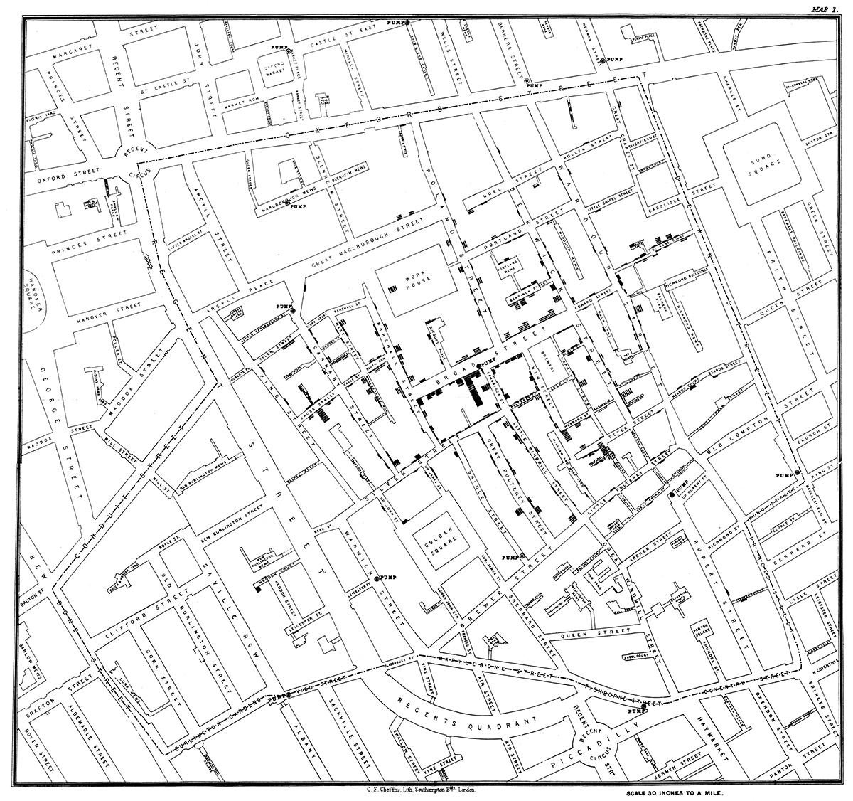
IPS’ work is evidence-informed: They rely on scientific knowledge, using a fair degree of flexibility to allow for unique conditions, to make sound decisions. The plethora of data out there is limitless. Accessing, using and interpreting the data has its challenges. GIS allows IPS to harness that data and look for trends and patterns to make sound decisions.

For its work in addressing health disparities among the Latino population in San Diego’s South Bay, IPS collected data from many different sources: health, crime, socioeconomic, education and environmental. The team then compiled the data into a geodatabase and mapped it on top of census tracts or ZIP codes to visually represent conditions in the South Bay. This decision-making tool enables the project team to identify communities most in need of intervention.

Media Advocacy

Getting IPS’ messaging into the news is key to impacting policy and systems change. Media advocacy is purposeful and strategic and not designed to only inform the public of policy impacts. Television and print news rely heavily on compelling videos, photographs and infographics, such as interactive maps, to help tell the story that the audience can relate to and empathize with.

For instance, in 2019, several college campuses around the country dealt with the tragic consequences of binge and underage drinking, particularly in fraternities. This included IPS’ own San Diego community. To put a face to each of the victims and to tell their stories, IPS created a map that pinpointed where each tragedy took place with pictures and text. The map was submitted with a news release to local media outlets to engage viewers in understanding the problem and advocating for policies at either the university administration level or the national fraternity organization level to protect college students.

Policy Buy-In and Development

Gaining support for a policy can be complicated. It requires awareness and buy-in of all stakeholders. GIS provides tools such as maps, data dashboards and story maps to help communicate policy goals in an easy-to-understand manner to stakeholders, such as decision-makers, community members, enforcement agencies and news media.

The Binge and Underage Drinking Initiative (BUDI) at IPS works on preventing harm from alcohol, especially among teens and young adults. To gain support from the harm prevention community for BUDI’s policy advocacy work, IPS created a story map to highlight the issue of alcohol problems in San Diego County and presented it at the Alcohol Policy Panel of San Diego County’s quarterly meeting. The story map combines pictures, graphs, maps and text to provide a multidimensional narrative of alcohol harm prevention efforts.

Sustainability

For a policy to succeed, it requires community awareness and regular and consistent enforcement. Compliance checks ensure that businesses, for example, are following municipality- or state-mandated regulations that keep neighborhoods free from harm. This helps keep businesses accountable and builds trust among community members.

GIS allows IPS to collect its own data to make sure policies are upheld. For example, it created an app that assesses a bar or restaurant’s compliance with the state alcohol regulatory agency’s rules on responsible beverage sales and service.

In the past, observers recorded their assessment on paper. By digitizing the assessment so that it is accessible on a mobile device, the user can discretely record their observations and immediately build upon the underlying database. The database is then used to track the policy’s enforcement over time. It also informs the AOD prevention community if a bar has done a commendable job at preventing over-service of alcohol, or if intervention is necessary to advise bar owners and managers of lapses in responsible business practices. The process is now more efficient and less cumbersome for data recorders.

Community Organizing

Communities that rally around an issue will find success when they fully understand the underlying reasons for the problems they encounter. Maps help community groups grasp how a geographic location is related to disease, crime and other threats to health and safety.

Team members in IPS’ Pomona office are food security and nutrition champions in their city. Green space and urban gardens are found to promote nutrition and physical and mental health. But what happens when children and teens do not have access to them?

To answer this question, IPS first mapped out the locations of healthy food sources (farmer’s markets, urban gardens, fresh food markets, etc.) and fast food restaurants. The locations’ proximity to a local middle school was symbolized through different colored lines – blue for healthy and nutritious sources, red for unhealthy fast food. The resulting map showed that the red lines were shorter than the blue lines, meaning more fast food restaurants were closer to the middle school than healthy food sources. This demonstrated that students were at an increased risk of dietary problems and resulting diseases, because healthy foods were not as accessible as non-healthy options. Visualizing the data this way prompted support for establishing more urban gardens near the school and nutrition education at the school.

Because GIS is both an art and a science, IPS continues to promote healthy and safe communities by leveraging the technology’s creative and analytical tools, making this dynamic system appealing to anyone who has a stake in envisioning a brighter future for their communities.

Author:
Meredith Gibson
Media Director, IPS

Meredith Gibson is the Media Director for the Binge and Underage Drinking Initiative, Countywide Media Advocacy Project, and Partnerships for Success. She generates news articles to promote awareness of public health issues, collaborates on opinion editorials (op-eds) with community leaders, and pitches ideas and spokespersons to news outlets, amassing media coverage at the local and national levels.

The Role of GIS in Public Health

As seen on GovLoop.

Geographic information systems (GIS) answer the question of where: where diseases are prevalent; where vulnerable populations live; and where resources are most needed to improve health conditions. GIS consists of the data, technology and people who answer these questions. And it has never been more relevant than it is today.

In the past year alone, health professionals have used it to address the COVID-19 pandemic, opioid epidemic, vaping-related respiratory illness and other diseases and injuries.  GIS is helping public, private and non-profit organizations make effective and efficient decisions, from collecting data to analyzing it to presenting it in a user-friendly manner.Snow Cholera Map

History of Mapping and Public Health

In the nineteenth century, John Snow was the first to use mapping in epidemiological research. In 1854, London suffered from an outbreak of cholera, and Snow mapped the locations of those stricken by the disease. By looking at where cholera victims lived, he observed a spatial pattern and identified the water source suspected of being responsible for the outbreak. This event marked the founding of epidemiology – the study of patterns, causes and distribution of diseases and health-related events.

This image is of John Snow’s map of cholera cases in London 1854.

Uses in Public Health

GIS benefits public health by:

  • Collecting information. The prevention of disease is paramount in developing healthy individuals and communities. But first, we need to understand what conditions exist that compromise health and safety. Policymakers cannot make evidence-informed decisions without qualitative or quantitative data to back it up. To collect the data, for example, an app can be created in which users report signs of blight in their neighborhood, which municipal agencies can use to prioritize cleanup crews.
  • Analyzing spatial patterns. Instances of disease can be mapped and analyzed to reveal patterns in its distribution, as evident in John Snow’s cholera map. But this just scratches the surface of GIS’ analytical capabilities. For example, you could use a proximity analysis to identify “food deserts” — an area that has limited access to affordable and nutritious food — in relation to schools or youth-centered establishments to help school districts create policies that make accessible nutrition a priority for students.
  • Allocating resources. You wouldn’t want to build a hospital in an area where there are several others. Nor would you want to deprive a rural community of access to much needed health care. GIS enables planners to figure out the best location for health care services based on the population served.
  • Presenting data in an easy-to-understand way. Most humans are visual beings, and looking at a map or data dashboard compared to reading rows of numbers is a good way to help users understand the distribution of health issues. For instance, it is easier to tell where there are cancer clusters in a region by a heat map than by looking at a spreadsheet.

GIS Tools

No matter which GIS software you use, four basic tools can help any public health professional in their role as a disease-fighting superhero:

  1. Maps — the most basic of GIS tools. It can contain geopolitical layers such as census tracts, zip codes, city council districts or health agency sub-regions. It can include layers of demographic data, such as the number of households that live below the area’s median income. And it can also include health data, such as the percentage of the population with a substance use disorder.
  2. Story maps. As the name implies, they narrate a story in a compelling way with maps, photographs, text, videos and charts.
  3. Crowdsourcing apps. These apps are a great way to collect data in the field by being accessible on a mobile device. The methodology in collecting the data is a good way to encourage people to be active and engaged stakeholders in their community.
  4. Data dashboards. These provide key insights on data. You can combine maps, charts, gauges, lists and text on a single computer screen to present data.

Even with all these tools, the most valuable asset in GIS is the public health professional – the one with the innovation and creativity to collect data, map it, analyze it and present it.

Author:
Meredith Gibson
Media Director, IPS

Meredith Gibson is the Media Director for the Binge and Underage Drinking Initiative, Countywide Media Advocacy Project, and Partnerships for Success. She generates news articles to promote awareness of public health issues, collaborates on opinion editorials (op-eds) with community leaders, and pitches ideas and spokespersons to news outlets, amassing media coverage at the local and national levels.

How GIS Exposed Racial and Socioeconomic Disparities in San Diego’s South Bay

As seen on GovLoop.

Geographic information systems (GIS) is playing an important role in helping San Diegans address health inequities along the U.S.-Mexico border.

An Upstream Approach to Substance Use Prevention

The Partnerships 4 Success (P4S) project uses geospatial technology to map conditions in San Diego’s South Bay. This area is known for its diversity and Latino cultural heritage. However, it is also known for its binge and underage drinking along the U.S.-Mexico border as well as methamphetamine use and cross-border juvenile drug smuggling.

The project aims to advance opportunities and policies that create a healthy and vibrant South Bay by reducing substance use. The team does this by addressing the factors that lead to the region’s harmful conditions, specifically among the Latino population.

P4S takes a community-level approach to substance use prevention, because the neighborhood where a person lives often determines if they experience positive or negative health outcomes. It influences their quality of life and even their life expectancy.

Communities of color historically experience greater health disparities than their white counterparts due to factors such as a lack of access to transportation, health care, quality education, housing security and economic opportunity. These communities also may experience more crime, violence, blight and exposure to high-risk businesses such as bars and liquor stores.

Moreover, all these factors are heavily influenced by racism, discrimination and social injustice. They can create what is referred to as community trauma. It is not surprising then that all this toxic stress can lead to a high risk of substance abuse.

Using GIS to Guide Policy Decisions

By using ArcGIS Pro, the P4S team identified the census tracts in the South Bay most in need of intervention by creating a trivariate choropleth map. In laymen’s terms, this is a map that depicts three different data layers in an easy-to-interpret map. The map shows the Hardship Index, Child Opportunity Index and the percentage of the Latino population.

The Hardship Index is a composite of six scores:

  1. Unemployment rate
  2. Dependency (% of the population older than 65 or younger than 18)
  3. Low education attainment (% of those over the age of 25 with less than a high school education)
  4. Per capita income
  5. Housing overcrowding (more than 1 occupant/room)
  6. Poverty level (less than 100% of federal poverty)

The greater the hardship, the darker the color of the census tract on the map.

The Child Opportunity Index is an index that captures neighborhood conditions that matter for children’s healthy development in terms of education, health and environment, and social and economic opportunity. The lower the childhood opportunity, the darker the color of the census tract.

The Hardship Index and Child Opportunity Index were combined into one color scheme. The third data set is the Latino population. The larger the point symbol, the higher the Latino population.

With this GIS map, the P4S team identified two distinct areas in the South Bay where there was low childhood opportunity, high hardship and a significant Latino population where intervention would be most valuable.

Supporting Positive Outcomes 

A core group of experts in public health, social services, education, faith organizations, mental health and government will lead the project and work with these communities to advocate for improved community conditions.

By giving the South Bay the chance for greater health opportunities, the project hopes to build a community where everyone has an equal chance at the type of life they want to live.

Author:
Meredith Gibson
Media Director, IPS

Meredith Gibson is the Media Director for the Binge and Underage Drinking Initiative, Countywide Media Advocacy Project and Partnerships for Success. She generates news articles to promote awareness of public health issues, collaborates on opinion editorials (op-eds) with community leaders, and pitches ideas and spokespersons to news outlets, amassing media coverage at the local and national levels.